Infomedics
Reducing support calls through self service design
Year
2024
Timeline
6 months
Category
Fintech
Role
Lead UX
Problem statement
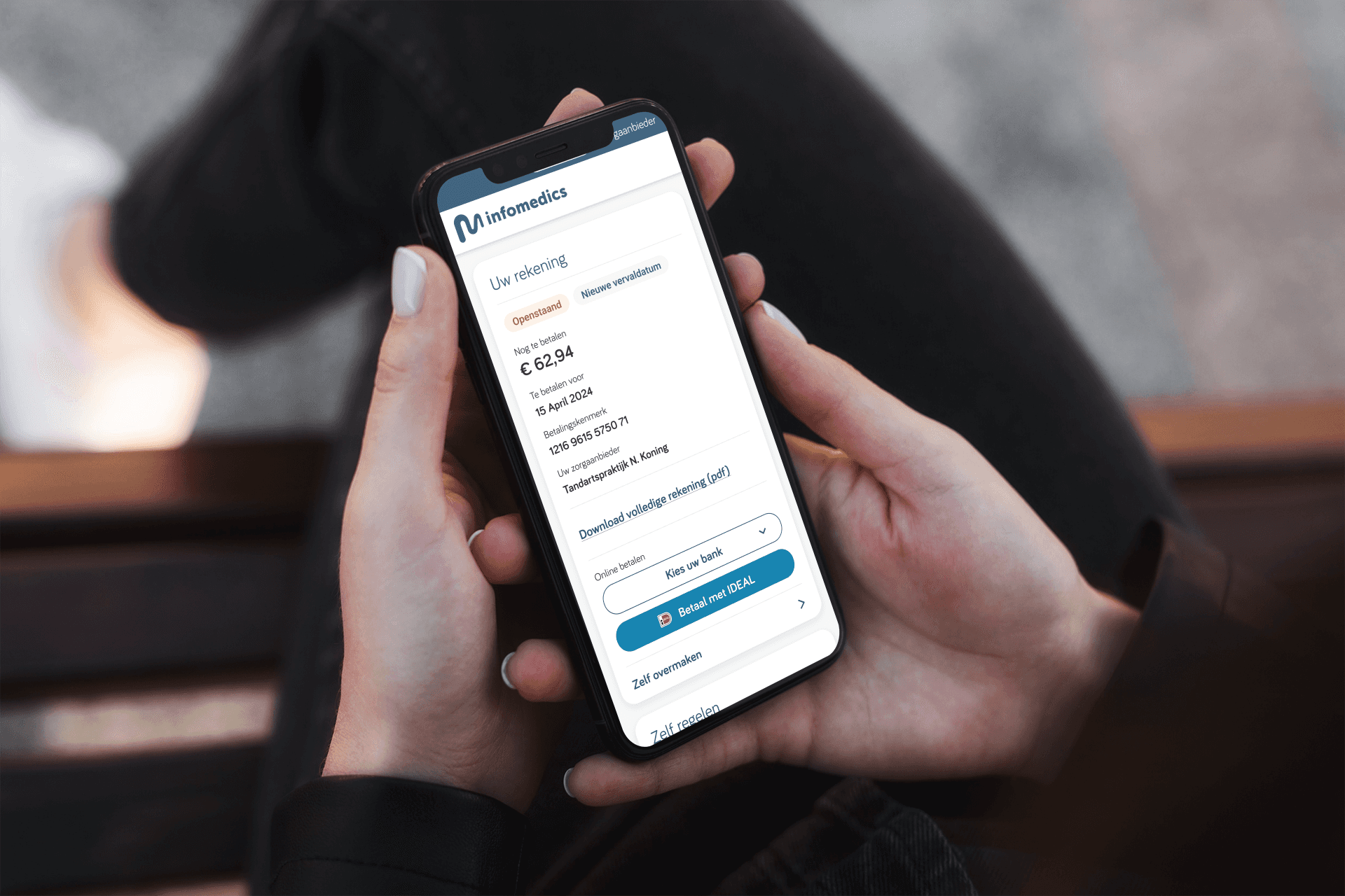
More than half of all customer service contacts at Infomedics were questions users could have answered themselves — if the payment portal had made it possible. 54% of incoming calls were about bill status overviews, 19% required redirection to healthcare providers, and another 22% involved payment arrangements or deferrals. The payment page wasn't pulling its weight.
Approach
I led the UX effort end-to-end as Lead Product Designer: from research setup and usability testing to final design validation. I collaborated with the product and development teams to navigate technical constraints and align on business goals. I started in discovery by running usability tests on the existing payment page to understand where and why users dropped off. The findings were clear: navigation was confusing, payment instructions were ambiguous, and users received no confirmation after completing a transaction. In the define phase I translated these into a focused set of design goals centred on self-service — giving users direct access to bill overviews, payment arrangements, and deferral options without needing to call. With the problem defined I created wireframes and interactive prototypes in Figma, iterating on layout, hierarchy, and UX copy until the flows felt intuitive. I then ran a second round of usability testing in the deliver phase to validate the redesign against the original pain points before handing off to development.

Results
Validation testing showed a significant improvement in task completion and perceived clarity. Users consistently completed payment flows without assistance and expressed greater confidence in the outcome. The redesign was greenlit for development based on validation results, with the anticipated reduction in inbound service contacts as the primary business case.
Conclusion
Complex financial flows demand relentless clarity. Every label, every confirmation state, every error message is a moment where a user either trusts the system or picks up the phone. Getting the copy right matters as much as the layout.